Getting started
This guide covers every step of the dashboard – from exploring the map to analysing detailed travel trends. Select each step below to expand the instructions.
Step 1: Explore the map
The map is your starting point. Yellow bubbles represent clusters of countline locations grouped by area. The number inside each bubble shows how many countlines are in that cluster. Larger bubbles show denser areas of monitoring.
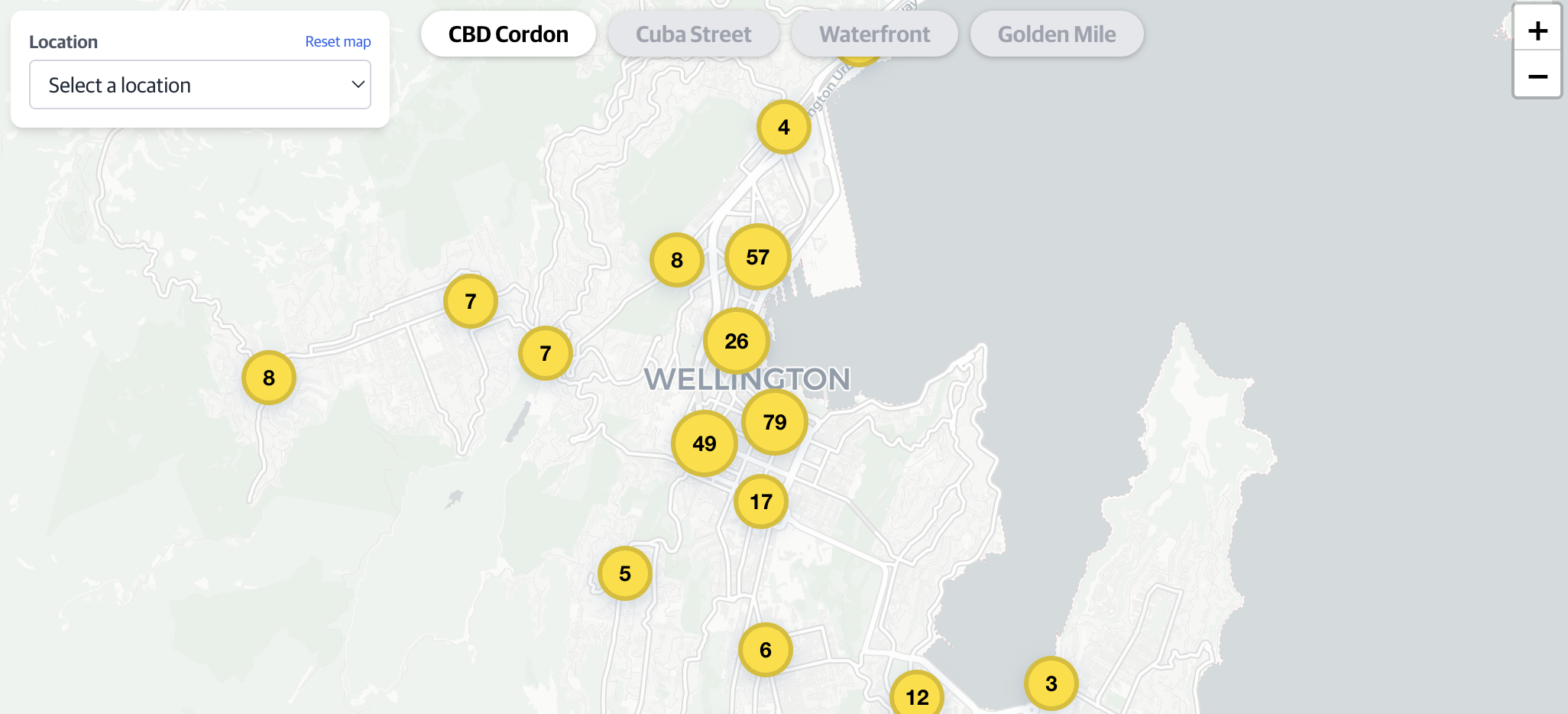
Use scroll or pinch to zoom in and out. As you zoom in, bubbles break apart to reveal individual countline locations on specific roads.
Step 2: Select a countline location
Once zoomed in, you will see yellow lines crossing roads. These are countline locations – fixed monitoring points that record vehicles and other travel modes passing through.
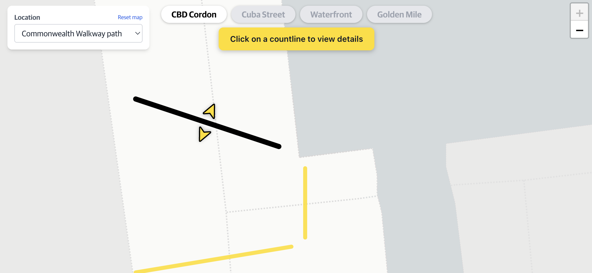
Select a yellow countline location to open a summary popup with key transport data for that location.
Step 3: Summary popup
After selecting a countline location, a popup appears showing the daily average travel figures for the past 30 days. This gives you a quick snapshot of how busy that location typically is.
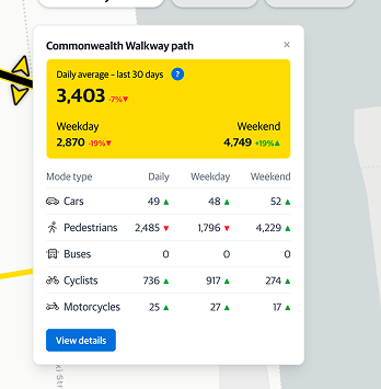
The popup displays total daily movements for weekdays and weekends, along with the top 5 transport modes. Arrows show how these figures compare to the same period last year. To explore historical data, select the 'View details' button at the bottom of the popup.
Step 4: Start exploring the data
Selecting View details opens a sidebar panel on the right side of the screen. The sidebar has three tabs – each giving you a different way to analyse the data for that countline location.
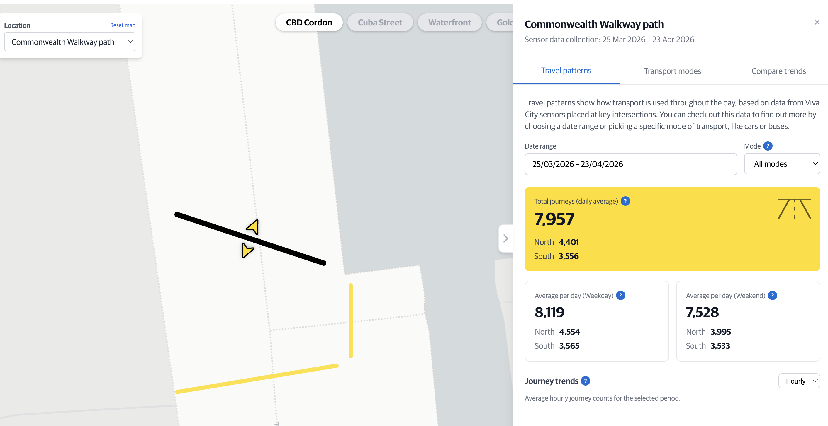
The sidebar stays open while you navigate the tabs – you don't need to close and reopen it.
Step 5: Travel patterns tab
The Travel patterns tab lets you filter by a specific time period or transport mode and then view the results as hourly and daily average movement charts.
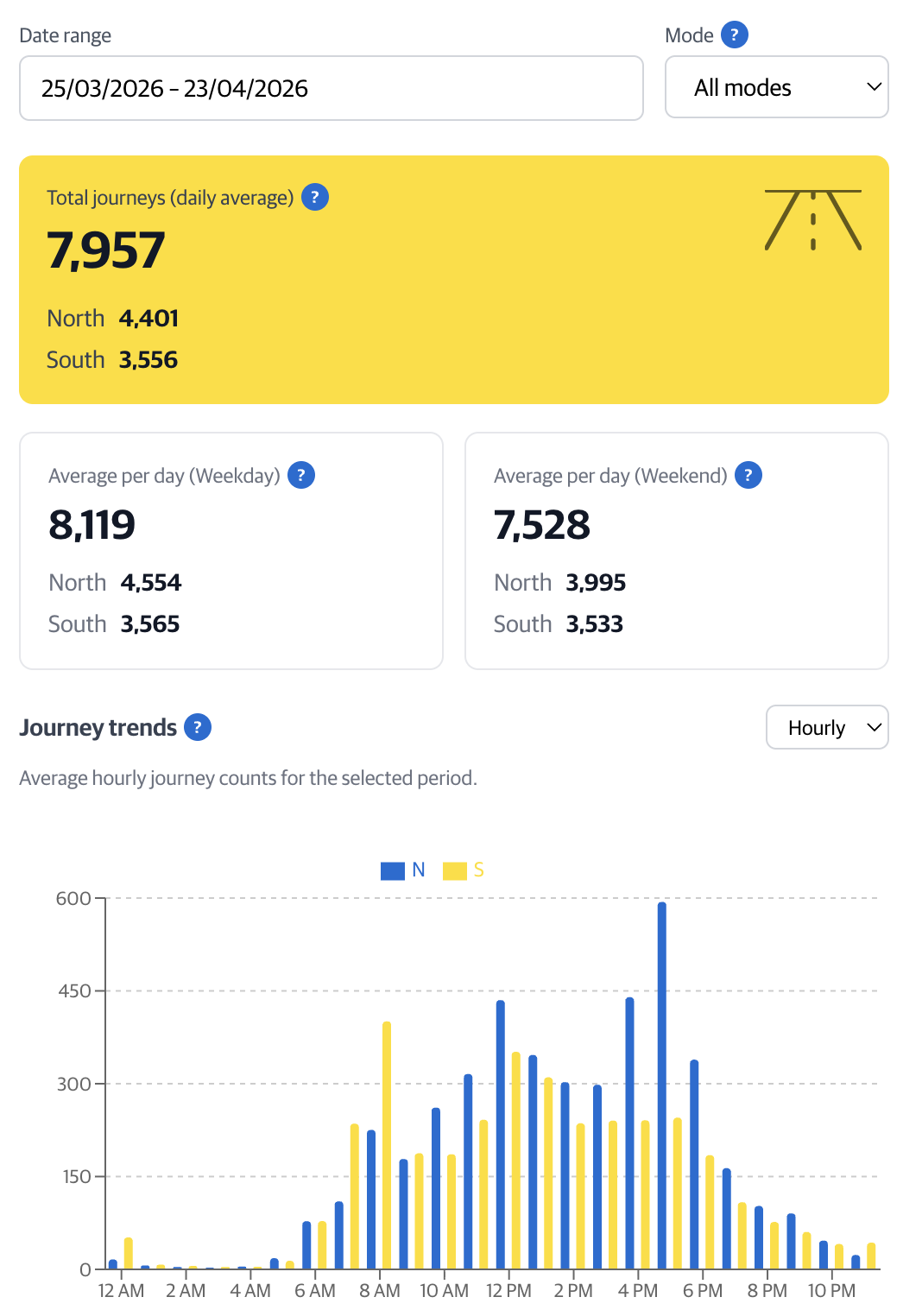
Use the dropdowns to switch time period or filter to a specific mode such as cycling or bus.
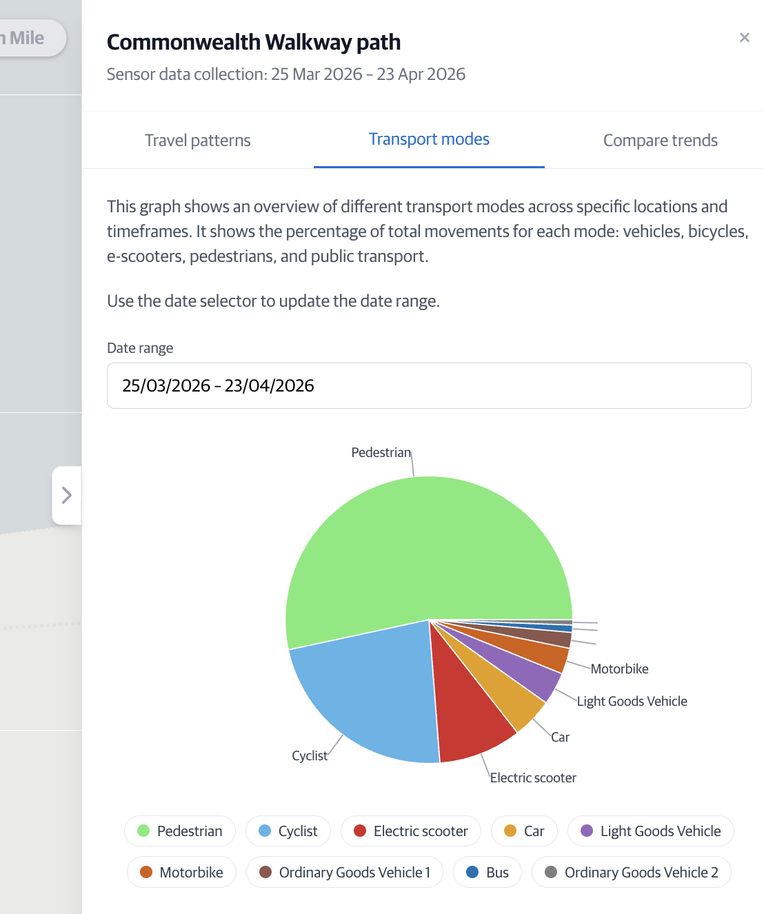
Step 6: Transport modes tab
The Transport modes tab shows the breakdown of how people travel through the countline location. Use the date range selector to see how mode share shifts over different periods.
Step 7: Compare trends tab
The Compare trends tab allows you to set two date ranges – Range A and Range B – and overlays their day-of-week averages on one chart. You can also filter by direction and select specific transport modes, which will apply to both date ranges.
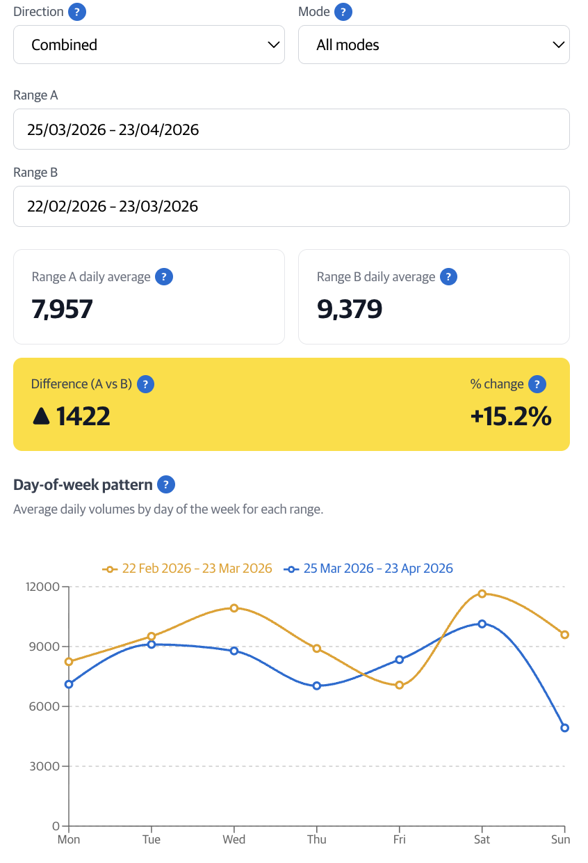
Set Range A and Range B using the date inputs. The chart updates to show average daily volumes for each day of the week. Use this to measure the impact of events, infrastructure changes, or seasonal shifts.
Interpreting changes in counts
When comparing data across different time periods, a range of factors can influence what you see. Before drawing conclusions, consider whether any of the following may explain observed differences.
- Weather conditions and seasonal effects
- School terms, public holidays, and holiday periods
- Public events, festivals, protests, or one-off activities
- Roadworks, maintenance, detours, or temporary closures
- Changes to public transport services or timetables
- Wider social, economic, or behavioural changes (for example, remote work)
- Overall shifts in travel demand or mode choice
- Sensor outages, maintenance, data accuracy issues, or configuration differences
- Differences in sensor coverage, directionality, or installation dates
- Short or non-comparable date ranges (for example, different day-of-week mixes)
A minimum three-month period is recommended when analysing countline trends, as shorter timeframes are more sensitive to events, weather, and temporary sensor variability and should be treated as indicative only.