Ngā kitengea hāereere i Pōneke
Pōneke travel insights
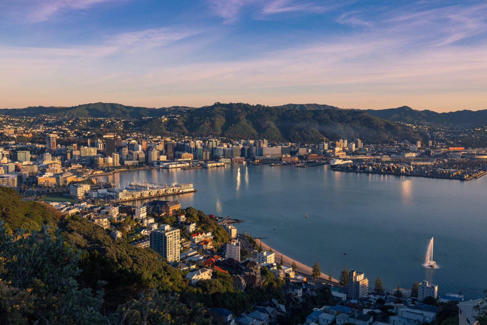
This story explores how people move around Wellington
Transport data at your fingertips
Transport sensors placed at key locations around Pōneke help us better understand the way our city’s roads, bike lanes and paths are used.
Using the latest sensor technology, we can analyse anonymous data that shows the movement of pedestrians, cyclists and vehicles across the capital. Now everyone can access this information through our new user-friendly data analysis tool. Whether you're planning your commute, interested in travel trends, or just curious about how people get around, this tool makes complex transport data more accessible for all. Simply select a location and you’ll see the average daily total from the last 30 days across five types of transport. If you want to explore further, the tool also allows you to choose different time periods, transport types, and views, to compare travel patterns and trends.
All information is based on sensor counts at specific locations. No personal information is collected or recorded by the sensors, and video frames are blurred to protect privacy. Note that data may be affected by where monitors are placed and how they operate, so should be read with this in mind.
To find out more about locations of sensors and how we do these counts, visit the Transport Sensors page.
Popular links
The map below is an interactive visualisation of transport countline sensors across Wellington. If you cannot use the map, you can view the raw data (opens external site in a new tab).
Explore the data
You can access the raw data underpinning this dashboard.